A black-and-white landscape print works when the photograph remains clear after colour has stopped doing part of the job. A tree must still separate from the field behind it; a path must still lead somewhere; a sky should contribute more than a large pale area. Monochrome is a way of interpreting the scene, not an automatic improvement to every photograph.
If you are choosing a picture for a Bearsted or Thurnham home, begin with the image rather than the room's colour scheme. The local connection can matter, but the photograph also needs to hold together as a composition. This guide helps you assess that structure and then consider how to present it.
Look for separation between the main shapes
In a colour photograph, two objects may be distinct because one is green and another brown. In black and white, they can become similar shades of grey. Look at the actual monochrome version, not a colour thumbnail you imagine will convert well, and check whether the important shapes remain separate.
Try viewing the image small enough to see its broad arrangement without concentrating on detail. Can you still identify the main subject and the route through the picture? If the composition only becomes understandable when you study tiny textures, it may be less effective across a room.
Then enlarge it and inspect the quieter areas. A photograph needs more than one striking outline if you hope to enjoy it for years. Smaller relationships, transitions and textures can give the image depth once the first impression has become familiar.
Decide how much contrast suits the subject
Strong blacks and bright whites can create a graphic picture, but not every landscape benefits from that treatment. A woodland scene may need a wide range of intermediate tones to remain readable. A simple tree silhouette may work with a much bolder division between light and dark.
Look for areas that have become featureless. Deep black may be intentional, but it should support the image rather than hide its main subject. Similarly, a pale sky can offer space, yet it may feel unfinished if it occupies a large area without any compositional role.
Compare different photographs at a similar size and brightness where possible. A heavily contrasted thumbnail can win attention quickly while a quieter image may be more rewarding in print. Give both enough time before deciding which one you would like to live with.
Keep the place recognisable if that matters to you
Removing colour can change how a familiar place is recognised. A roofline, path or tree arrangement may remain clear, while a scene identified mainly by seasonal colour may lose part of its connection. Ask which feature makes the photograph feel local to you.
For a gift, this question is especially useful. A recipient may recognise a route instantly in one composition and struggle with a more abstract interpretation of the same place. Neither picture is inherently better, but they serve different kinds of memory.
The Bearsted Green article explores recognition through space and relationships. Use that approach when comparing monochrome options: look beyond the caption and decide whether the image itself contains the connection you want to keep.
Consider viewing distance before fine detail
A photograph seen above a sofa has a different job from one beside a reading chair. From farther away, the main tonal shapes need to remain legible. Up close, a detailed architectural or woodland study can reward attention that would be lost across a larger room.
Use a paper outline of the proposed outer frame size to test the position. Then view the image at a modest size from a similar distance as a rough compositional check. This does not reproduce the finished print, but it can reveal whether you are expecting tiny detail to do too much work.
Our size guide separates image dimensions from outer frame measurements. That distinction matters just as much for monochrome as colour: a generous mount can make the framed object large while the visible photograph remains comparatively small.
Compare oak, black and white without assumptions
A black-and-white photograph does not require a black frame. A dark finish can give it a firm boundary, a pale finish can make the transition to the wall feel lighter, and an oak-toned finish can introduce warmth. Judge the combination rather than following a matching rule.
Keep the crop, size and mount constant while comparing finishes. Otherwise it is difficult to know whether you prefer the frame or another changed element. Look at the whole object first, then consider how its border relates to furniture and nearby pictures.
The gallery's finishes are illustrative choices whose physical specifications are confirmed through enquiry. A digital oak effect or white swatch is not an exact material sample. If a subtle match matters, ask about the actual finish before relying on the screen.
Give the mount its own attention
The mount creates a pause between photograph and frame. In a monochrome picture, its shade can be particularly noticeable beside pale areas in the image. A warm mount and a cooler-looking print may create a distinct relationship that is easy to miss in a small preview.
Consider the width as well as the colour. More surrounding space can help a complex image feel contained, but it also changes the proportion of image to finished object. Ask for the actual visible image area and outer dimensions rather than deciding from a product label alone.
Read picture mounts explained for a worked measurement example and the questions to ask about construction. Appearance does not establish conservation quality or the lifespan of a framed print, so keep material claims tied to the confirmed specification.
Confirm the version you are buying
If a seller offers both colour and monochrome, make sure the quote and preview identify the exact version and crop. Do not assume a request to remove colour is a routine option for every artwork. The photographer may have approved only certain interpretations or sizes.
Bearsted Gallery's current reference collection is shown as supplied on the artwork pages; this article does not promise a monochrome edition of every image. Browse the gallery for the available previews and use an enquiry to ask about a particular requirement before treating it as an offered product.
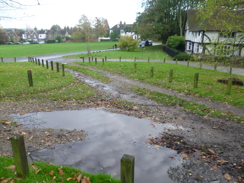
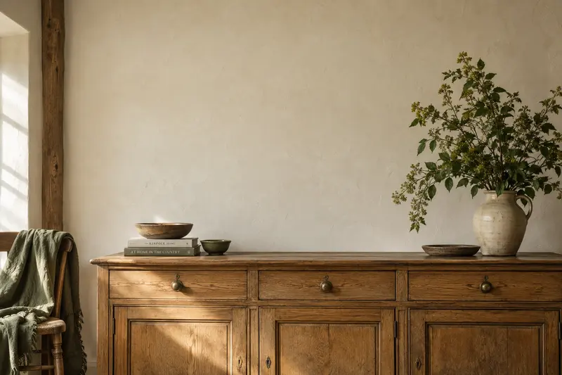
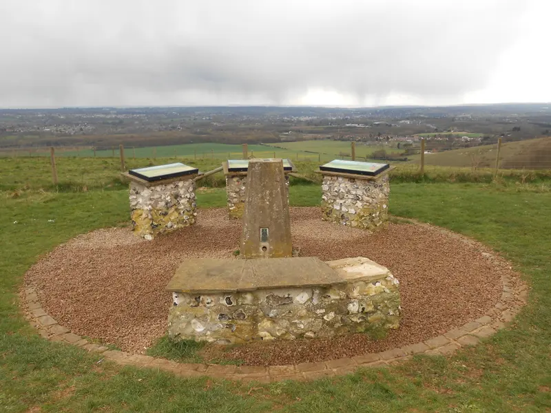
For further background on tonal thinking, Adobe's black-and-white photography guide discusses the medium. The photographs illustrating this article remain colour reference images, with credits on the site. They demonstrate subjects to consider, not finished black-and-white products or a physical print comparison.
A place for your wall.
Explore the collection, then choose a size and finish at your own pace.