A photograph of a familiar place has a different job from a photograph of somewhere spectacular. It does not need to persuade you that the place exists, or that it deserves attention. Often, the connection is already there. What matters is whether the picture gives that connection room to return: a path across the grass, a building at the edge of the frame, the balance between an open space and the houses around it.
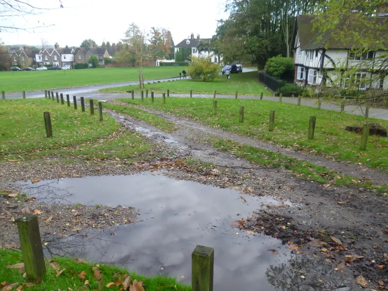
Bearsted Green offers a useful way to think about this kind of photograph. In the reference image used in our preview, the village is seen as a place with ordinary surfaces and relationships. The photograph is not presented as our own visit or a newly commissioned print. It is a starting point for looking carefully, before choosing what an original collection should include.
Begin with what you recognise
Try looking at the photograph without reading its title. What makes it recognisable to you? The answer might be a building, but it might equally be the amount of space between things. A village green is not just a patch of grass. It is an arrangement of edges, routes and places to pause. The way a path crosses a view can be as important as the architecture beyond it.
For someone who knows Bearsted, an apparently small feature may carry a specific memory. Another person may respond to the same photograph as a calm arrangement of colour and shape. Neither response is more correct. A good local photograph can make room for both: a precise connection to somewhere real, and a composition that remains satisfying when you stop thinking about the place name.
When comparing pictures, notice where your eye goes first and where it rests. If the part you recognise sits awkwardly at the very edge, a different crop or viewpoint may feel more natural. Recognition is a useful beginning, but it need not be the only reason to choose.
Look at the spaces between buildings
It is tempting to treat a village photograph as a collection of landmarks. Looking at the space between them often produces a more revealing reading. A strip of sky, a band of grass or a line of trees can give a picture its rhythm. Remove too much of that space and the photograph may become busier, even though it contains fewer objects.
In a framed print, these relationships become more noticeable because the picture has a fixed boundary. The mount gives the eye a pause before it enters the scene. The frame then separates the photograph from the room. A broad view can benefit from this breathing space, particularly when the subject includes several buildings or overlapping branches.
This is one reason to look at the actual crop before ordering. A square version of a village scene is not simply a landscape photograph in a shorter frame. It changes the balance between the centre and the edges. The right version is the one that preserves what drew you to the image in the first place.
Let history add context, without filling every gap
The parish council’s account of Bearsted connects the village with Holy Cross, several earlier hamlets and a long community history. It also describes cricket on the Green. Those details help explain why this open space can carry meaning beyond its appearance. They are background context, rather than evidence for a particular event or date in the reference photograph.
A responsible caption should distinguish between what is visible, what is documented and what is interpretation. “A view across Bearsted Green” is a straightforward description. A claim about the year, season, weather or people in a photograph needs a reliable record. Adding a charming story does not improve an image if the story has been guessed.
For an original gallery collection, the useful records are often simple: the photographer’s name, the place, the capture date where available, and the reason that viewpoint was chosen. These details make it easier for a buyer to understand what they are seeing. They also allow the photograph to retain its own character instead of becoming an illustration for an invented anecdote.
Imagine an ordinary place on an ordinary day
Not every local photograph needs sunset light or an empty street. A place you know is usually experienced through repetition: passing it on the way somewhere, noticing the weather, seeing the same outline against a different sky. An image that respects that ordinary familiarity can remain interesting for a long time.
This does not mean that composition is unimportant. Quiet photographs often depend on very deliberate decisions. The photographer chooses where to stand, how much foreground to include and which edges to keep clear. A small change of position may make a path easier to read or separate a tree from a roofline. Those choices can make a scene feel settled without making it look artificial.
When you are choosing art for home, ask whether you want the photograph to act as an event or as a companion. Some pictures announce themselves every time you enter a room. Others become part of its atmosphere. A familiar village scene can do either, depending on its light, scale and framing.
Choose a frame around the photograph
The first framing question is not which finish is most fashionable. It is which finish supports the picture and the room you already have. Oak can echo earthy colours. Black can establish a clear boundary. White can create a lighter transition into a pale wall. These are visual possibilities, not rules that every interior must follow.
Try comparing the same image in each finish while keeping the size unchanged. That removes one variable and makes the difference easier to see. Then look away from the screen and think about the materials around the intended wall: a shelf, a door, a table, a nearby picture. The frame does not need to match every object. It simply needs to feel intentional among them.
The finished outer dimensions matter more for placement than the image measurement alone. A mount adds space around the photograph, and the frame adds another edge. Mark the complete outline on the wall before deciding that a size is too small or too large. Our framing guide keeps those two measurements separate.
Keep the connection personal
A local print does not have to represent the most famous view. It can be a reminder of something that would be difficult to explain to anyone else. That is part of its value. A former resident may recognise a route, a new neighbour may be building an attachment, and a gift buyer may be thinking of a shared afternoon.
Start with that connection, then test the practical details. Does the photograph still work in the crop you need? Can you see its important features from where you will usually sit? Does the frame make the whole picture feel more complete? These questions are more useful than trying to decide whether a particular scene is objectively the best image of Bearsted.
Explore the Bearsted collection when you are ready. The current photographs are credited references, and the collection is still being developed. The aim is to make the eventual choice feel unhurried: a view you recognise, shown honestly, with enough information to imagine it in your home.
Sources and image notes
Local background was checked against Bearsted Parish Council’s introduction to the village. The historical context above is deliberately limited; this article is not a complete history or a walking guide. The reference photograph is by Marathon and is credited on our image credits page. This is a visual reading of credited reference imagery, rather than a firsthand account of a new shoot. For practical visit ideas, read things to do in Bearsted.
A place for your wall.
Explore the collection, then choose a size and finish at your own pace.