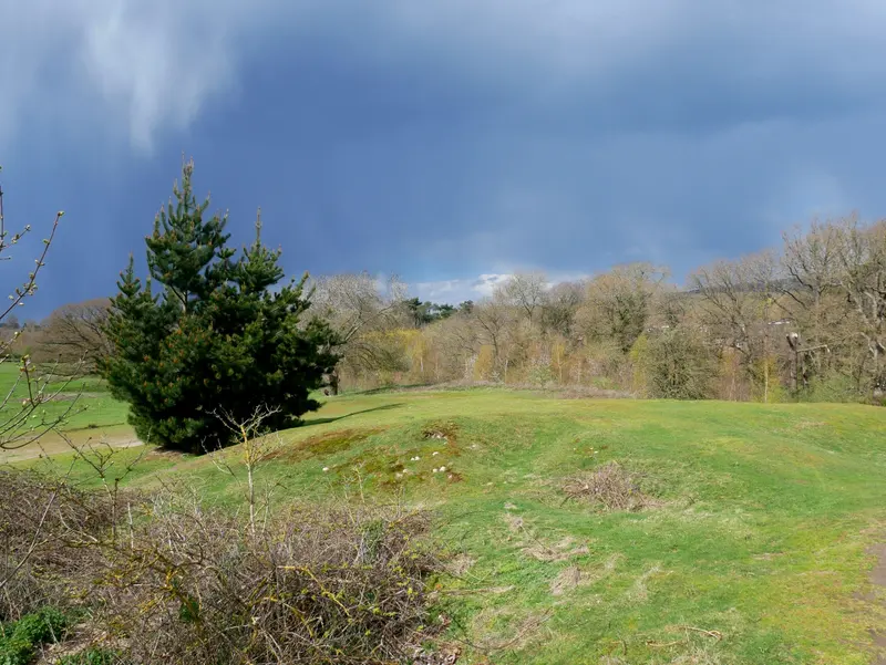

Natural oak
Soft black
Chalk white
A frame is a small part of the total area of a picture, but it can have a considerable influence on how the whole object feels. It creates the boundary between the photograph and the room. It can make that boundary distinct, soften it, or connect the image with materials already nearby. Choosing a finish is therefore less about finding the best colour in isolation and more about understanding a relationship.
The Bearsted Gallery preview offers natural oak, soft black and chalk white as three illustrative directions. They keep the choice manageable while allowing different effects. The final supplier profiles, materials and surface finishes are not yet confirmed. Use the previews to compare the visual ideas, then check the actual specification before agreeing to a purchase.
Start with one photograph and one size
The easiest comparison keeps everything except the frame finish unchanged. Choose a photograph and size first, then switch between the three finishes. If the image, crop and scale change at the same time, your response may be driven by something other than the frame you are trying to assess.
Look at the picture as a whole before inspecting the border. Does one version make the photograph feel more settled? Does another make it more prominent? Neither outcome is inherently preferable. A picture intended as a focal point may benefit from a clearer outline, while one joining a quiet arrangement may work better with a gentler transition.
Avoid making the decision from a very small thumbnail alone. A border that appears heavy on a phone can feel different at the real size, especially when a mount separates it from the photograph. The screen comparison is useful, but it should be paired with the outer measurements and an understanding of the actual frame profile.
What an oak finish can contribute
An oak-toned finish introduces warmth and visible material character. In a photograph with trees, fields or village textures, that warmth may echo colours already in the image. In a room with timber furniture, it can create a relationship without needing to reproduce the furniture’s exact shade.
The important word is relationship. Different woods can sit comfortably together, but there is no guarantee that every warm frame will suit every wooden surface. Consider whether the tones are similar, complementary or simply competing for attention. A pale wall and a restrained arrangement may allow more variation than a space with several strong finishes close together.
The gallery’s digital oak effect is an illustration, not a sample of grain or a promise about construction. A real frame can vary in texture and colour, and lighting changes the way it appears. Before ordering, confirm the material, finish, visible profile and any natural variation that matters to you. Those details are more useful than relying on a colour name alone.
What a black finish can contribute
A black frame gives the picture a more definite boundary. It can help organise a detailed photograph by separating the framed object from the wall around it. On a pale surface, the contrast may make the picture feel more deliberate and easier to read from a distance.
This does not mean black is reserved for monochrome photographs. A colour landscape can work with a dark frame if the outline supports its tonal structure. Look for dark areas within the photograph and notice whether the frame feels connected to them or simply imposes an unrelated edge. The answer will depend on both the image and the width of the frame.
Consider other dark elements in the room, such as a lamp, window frame or nearby picture. A black finish may connect those elements, but it does not need to match every one. The useful question is whether the whole arrangement feels intentional. A narrow dark outline and a broad dark border can behave very differently, so confirm the actual profile as well as the colour.
What a white finish can contribute
A white or pale frame can make the boundary around a photograph feel lighter. Against a similar wall, it may allow the image and mount to take more of the visual attention. Against a darker surface, the same finish can become a distinct outline. The wall therefore plays a considerable role in the result.
White is not a single fixed colour. Warm and cool tones can look noticeably different beside a mount, paint or another frame. The current chalk-white preview is intended as a warm, understated direction. It should not be treated as a colour match for a specific paint or existing object.
When comparing pale finishes, look at the relationship between frame and mount. If both are light, a small difference may become more apparent than it was on the screen. This can be attractive, but it should be considered rather than accidental. Ask for the final material description or a suitable reference before making a decision that depends on a precise match.
Give the mount a role of its own
The mount is not just a gap between the frame and the photograph. It gives the image breathing space and can make a complex scene easier to approach. It also changes the total size of the object, which is why the gallery shows outer frame dimensions separately from image dimensions.
A warm white mount is used throughout the preview to keep the comparison focused. Holding that element steady makes it easier to judge the finish choices. If a different mount is considered later, it should be reviewed with the photograph and frame together, because even a subtle shift can alter the balance.
Material claims need evidence. Terms about permanence, conservation or archival quality should refer to a confirmed specification rather than the appearance of a digital mockup. At enquiry stage, the useful questions concern what will actually be supplied: paper, mounting method, frame, glazing and hanging arrangements. The preview does not establish those physical properties.
Make the final choice in context
Before deciding, return to the room rather than continuing to switch finishes indefinitely. Look at the intended wall, its light and the nearby objects. Imagine the framed photograph as one element in that setting. If you already own pictures you enjoy, their finishes can offer useful clues about your preferences.
It is also reasonable to choose a finish because it makes the photograph feel right to you. A frame does not have to satisfy a complete interior design scheme. The practical checks are that the size fits, the materials are understood and the image remains the focus you want it to be.
The frame step lets you compare finishes after choosing your photograph. If you are uncertain, include that in the enquiry message. The next useful action is to confirm the available specification and see the complete choice together, rather than treating a digital colour swatch as the final object.
Preview and specification notes
All frame finishes in this article are illustrative previews. The gallery has not yet confirmed a frame supplier, timber specification, glazing or mount materials. Prices are indicative. The reference photograph and generated room illustration are identified on the credits page. For dimensions, see framing and sizes; for the relationship between crop and frame, read the shape guide.
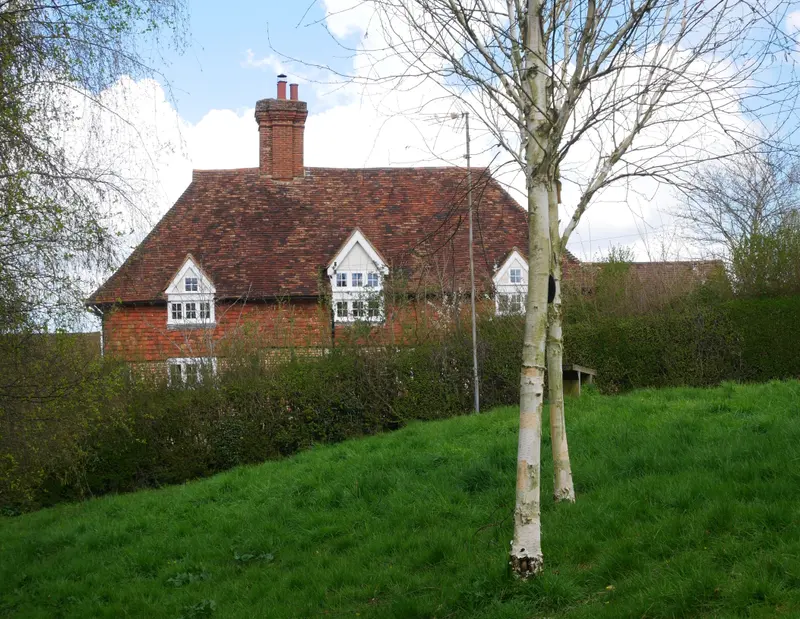
A place for your wall.
Explore the collection, then choose a size and finish at your own pace.