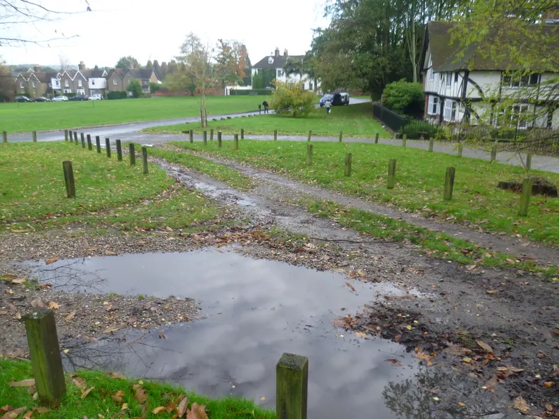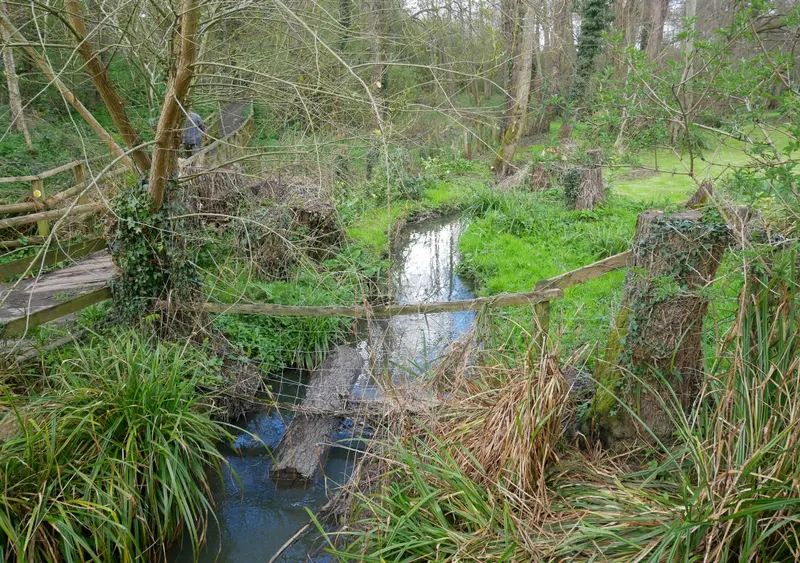
A photograph does not have to include a skyline or a famous building to feel connected to a place. Sometimes the strongest reminder is smaller: a bend in water, the meeting of branches, or the way a path disappears behind a tree. These details can be difficult to describe, but they are often easy to recognise when they belong to somewhere you know.
The woodland reference photographs in this preview offer a different scale from the village and downland views. They show scenes on Bearsted Woodland Trust land, with full creator credits available separately. This article considers how to look at those pictures and how a close landscape can work at home. It does not describe an undocumented visit or promise current conditions on a particular route.
Start with the subject you almost missed
Wide landscapes usually tell you where to begin. A horizon or a large building establishes the picture quickly. Woodland can ask for a slower approach. There may be several layers of similar colours, with no single object immediately claiming attention. That complexity can become part of the pleasure, provided the photograph gives the eye a way to navigate it.
Look for one point of distinction. It might be a pale branch against a darker background, a patch of water, or a gap between trees. Then notice how the surrounding shapes support that point. A successful detail photograph can feel ordered without removing the natural irregularity of the subject. Repeated verticals, curves or tonal differences help the picture hold together.
When comparing photographs, give each a few seconds beyond your first impression. A subtle image may not be the strongest thumbnail in a grid, but it can become the one you enjoy most at a larger size. The gallery’s detail view is useful for this slower kind of looking.
Water changes the pace of a picture
Water can introduce another visual language into a woodland scene. Reflections repeat and interrupt shapes, while the surface can create a softer area among sharper leaves and branches. The contrast is not only about colour. It is also about how much detail the eye is being asked to process in different parts of the frame.
In a photograph, water does not have to look perfectly smooth to be effective. Texture, small ripples and dark areas can make it feel more closely connected to the surrounding land. The photographic treatment should suit the scene. A long-exposure effect, for example, would be a creative decision to document accurately rather than an automatic improvement to every stream photograph.
For a wall print, consider whether you respond more to the water itself or to the space around it. If the relationship between the stream and its banks is the point, a tight crop might lose something important. The actual previewed crop should preserve the part of the scene that made you pause.
Think in layers, not just colours
Woodland pictures often contain a great deal of green, but colour is only one way to read them. There may be a close layer of leaves, a middle layer of trunks and a more distant opening. A photograph with clear separation between those layers can feel deep and spacious even when the view is tightly framed.
Try looking at the image from farther away. Fine detail will merge, making the main areas of light and dark more obvious. If the picture still has a readable structure, it may work well across a room. If its appeal depends on tiny details, it may be better placed where you can approach it comfortably and spend time looking.
This is not a distinction between good and bad photographs. It is a distinction between ways of experiencing them. A small print beside a reading chair offers a different encounter from a large landscape above a sofa. Choosing the right setting can help a quieter image reveal the qualities that are easy to miss on a small screen.
Respect the place behind the picture
A photograph can make a natural setting look separate from daily life, but places like these are used and cared for by people. The trust’s own publications describe community stewardship. That context matters when developing an original collection: the landscape is not simply a backdrop available for any kind of production.
Any future photography should respect current access information, other visitors and the features of the site. This article is deliberately not a directions page. It does not assess surfaces, water conditions, step-free access or the suitability of a path for a particular visitor. Those details need current official information and, where relevant, an informed personal assessment.
The same care applies to captions. A leaf colour does not establish the date of a photograph, and a quiet frame does not prove that a location is usually empty. An accurate place name, a photographer credit and verified capture information make a more useful foundation than an invented account of a peaceful morning.
Match the shape to the subject
A square crop can bring a close woodland composition together by giving similar weight to its height and width. A portrait crop can emphasise upright forms. A landscape version can retain more of the relationship between a stream, its banks and the surrounding trees. These effects depend on the actual photograph, not on the label alone.
Compare the crops as separate compositions. Check whether a branch now touches an awkward edge, whether a patch of bright sky distracts from the subject, and whether enough context remains. Our configurator only offers crops included in the catalogue for that image. Changing shape can therefore change which photographs are available.
If the image you love does not suit the shape you first imagined, it may be worth revisiting the space. A different size or placement could preserve the photograph without forcing it into a weaker crop. The simplest choice is not always the one made first; it is the one that still makes sense after you have seen the whole framed image.
Bring a small landscape into the room
Woodland photographs can relate to a room through texture as much as colour. Wood grain, woven fabric and matte surfaces may sit comfortably alongside organic details. That does not mean everything needs to be green or brown. A restrained frame can give a complex image enough separation from a patterned wall or a busy shelf.
Look at the frame finish after choosing the photograph and size. Keeping those decisions separate makes the comparison easier. An oak effect may make the whole object feel warmer. A black edge may organise the picture more clearly. A white finish may give a lighter impression. The screen is a guide to those relationships, not a guarantee of the final material’s appearance.
You can explore these reference images in Along the way. They are an invitation to consider the less obvious local subjects: places you pass through, details you recognise and photographs that offer something new each time you look. The finished collection should preserve that sense of attention, with original images and clear provenance.
Sources and image notes
Community context: Bearsted Woodland Trust’s Autumn 2024 newsletter. The woodland and stream reference images are by Doyle of London, under the licences recorded on our credits page. This article reads the credited reference photographs; it is not a route, access or wildlife guide. For preparation and current information sources, use our Woodland Trust visit guide.
A place for your wall.
Explore the collection, then choose a size and finish at your own pace.