A gallery wall is easier to plan when the pictures share a reason for being together. That reason might be places around Bearsted, a sequence from village to woodland, or photographs connected with a family's memories. Start with the relationship between the images, then solve the arrangement on the wall.
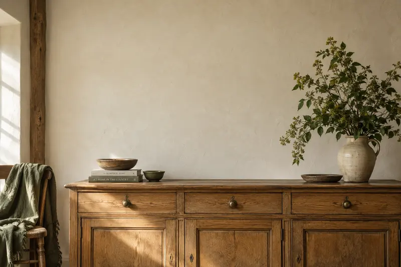
You do not need many pictures or matching frames to begin. Three well-chosen photographs can make a complete group. This guide uses a small, measured layout to show how to move from a collection of attractive images to an arrangement that feels intentional in your room. The accompanying room image is an illustration, not a real installation or a scale reference.
Choose one thread for the collection
Write a short description of what connects the pictures. “Places we walk around Bearsted” is more useful than “pictures that are quite nice”. A clear thread makes it easier to decide what belongs and what should be saved for another wall.
The thread does not have to be geographic. It could be a shared colour range, an interest in paths and trees, or photographs taken over several years. Avoid asking every image to match in every way. A group becomes more interesting when it has a clear connection and enough variation to reward looking.
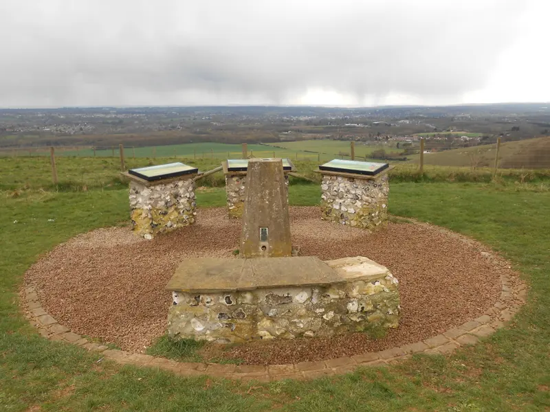
For a local sequence, consider a village view, a woodland scene and a wider landscape. The Bearsted, woodland and Thurnham collections offer those different scales. Compare the actual compositions rather than choosing one from each category simply to complete a set.
Give each picture a distinct role
One photograph may establish the group, another may add a quieter detail and a third may provide contrast. If every picture has the same horizon height, density and colour treatment, the group can feel repetitive even when the locations differ.
Lay small versions together before thinking about frames. Remove one at a time and ask what changes. If the group becomes clearer without a picture, that image may work better elsewhere. Editing the selection is often more effective than finding a clever arrangement for too many competing subjects.
Keep personal significance in the decision. A technically less dramatic image may deserve a central place because it carries a memory. The aim is a collection you enjoy, not a display designed only to impress someone who knows nothing about the places.
Measure the wall as a usable area
Record the space you can actually use, accounting for furniture, switches, door movement and anything already mounted nearby. The physical wall may be wider than the area that looks and works comfortably for pictures. Note the usual viewing position as well as the available width.
Use finished outer frame dimensions for the layout. Image sizes do not include all the surrounding material, and the difference adds up across a group. Our framed-print size guide explains the measurements to request.
Draw the usable area on paper and add the outer rectangles at a consistent scale. This small plan makes it easier to compare arrangements before making full-size templates. It also provides a record you can check if you later change one frame or add another picture.
Try a simple row with a worked example
Suppose you are comparing three hypothetical frames, each 42 centimetres wide, with 6-centimetre gaps. The total group width is 42 + 6 + 42 + 6 + 42, or 138 centimetres. That is the measurement to compare with the usable wall area, not the width of a single photograph multiplied by three.
On a 180-centimetre usable area, centring that group would leave 21 centimetres at each side. This is an arithmetic example, not a rule that the result will suit your room. Make paper templates and judge the arrangement from the doorway and usual seating position.
If it feels crowded, reduce the number of pictures or compare smaller outer dimensions before shrinking every gap. Narrow gaps can make frames feel like one heavy block. If it feels too sparse, a wider layout or a different scale may work better than adding unrelated images.
Choose what stays consistent
A group can share frame finish, mount colour, outer size or alignment. It rarely needs all four to match. Choosing one or two consistent elements gives the eye enough structure while allowing the photographs to retain their differences.
For mixed sizes, try aligning either the centres or one outer edge in your paper layout. Each produces a different rhythm. A centre line can feel calm across varied formats, while a shared lower edge may relate to furniture beneath. Compare both rather than assuming an irregular layout must be spontaneous.
If you mix finishes, repeat a finish somewhere else in the group so that it feels intentional. This is a design experiment, not a requirement. The frame comparison article can help you isolate what each border contributes before you combine several.
Test the complete arrangement at full size
Cut paper to the actual outer frame measurements and position the templates using a wall-safe method suited to your surface. Check the arrangement in daylight and under the room's evening lighting. Give yourself time to live with it before deciding where the real frames should go.
Look from the approaches people actually use. A group that feels balanced when viewed straight on may crowd a doorway or appear disconnected from the furniture when seen at an angle. Adjust the whole arrangement before fine-tuning individual gaps.
Paper templates help with visual placement; they do not establish suitable fixings. Confirm the weight and hanging method for each actual frame and use hardware appropriate to the wall. If you are unsure about installation, get advice for the specific wall and objects rather than following a generic picture-hanging shortcut.
Leave room for the collection to change
Decide whether the group is intended to be complete or to grow. If you want to add photographs later, keep a record of frame profiles, mount shades and dimensions. Similar colour names do not guarantee that a future frame will match the ones already on the wall.
You can also change the photographs without expanding the footprint, provided the actual frames and mounting arrangements support that safely. A fixed layout can hold different memories over time. There is no need to fill every remaining patch of wall simply because the collection has grown.
Before enquiring about several gallery prints, list the chosen images, shapes, outer-size needs and finishes together. Include any timing requirements and ask for a confirmed specification and total quote. The result should be a group that makes sense as pictures and as physical objects, with enough space for each view to remain worth looking at.
A place for your wall.
Explore the collection, then choose a size and finish at your own pace.