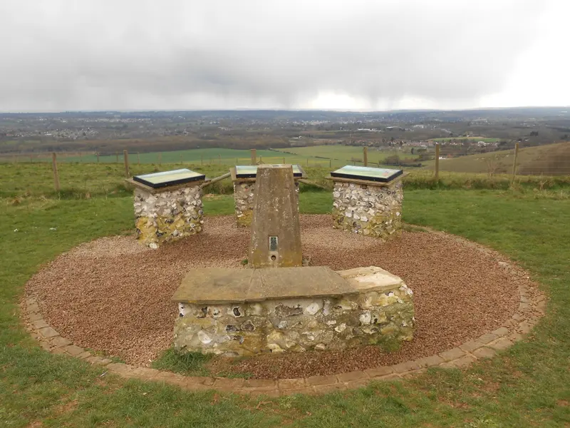
A wide landscape can look simple at first: fields, trees, a horizon and the sky above it. Spend longer with the picture and the relationships begin to matter. One field is brighter than another. A dark line holds the foreground together. The sky creates space, while a path or boundary gives the eye a route through it. The subject is the countryside, but the photograph is also an arrangement of light.
The landscape around Thurnham is the starting point for this part of the gallery. Our preview includes a credited photograph from White Horse Wood and a separately labelled generated mood study. They have different purposes. One records a real place; the other explores a visual direction. Neither is presented here as evidence of a new photographic visit by Bearsted Gallery.
Read the horizon before the details
The position of the horizon changes how a landscape feels. A low horizon gives the sky more influence. A high one draws attention towards the ground, where fields and boundaries can become the main subject. Neither is automatically more dramatic or more truthful. The decision depends on what the photographer wants the viewer to notice.
When choosing a print, try covering a small part of the top or bottom of the image with your hand. This is only a viewing exercise, not a proposed final crop. Notice how quickly the balance changes. A picture that seemed spacious may become enclosed. A scene that felt distant may become more immediate when the foreground receives more attention.
This exercise explains why an approved crop matters. If a photograph depends on a particular relationship between land and sky, cutting it into a different shape can weaken it. A thoughtful collection should offer the shapes that suit the image, rather than promising that every photograph can fit every frame.
Light gives the land its structure
Light does more than make a view brighter. It can separate planes, reveal textures and make a distant field stand apart from its surroundings. When part of a scene is illuminated and another part is shaded, the viewer receives a sequence of visual cues. The eye may follow those cues even before recognising the features in the landscape.
Soft light has its own strengths. It can make colours easier to compare and prevent one bright patch from dominating the photograph. Stronger directional light can emphasise the shape of a slope or the outline of a tree. The best choice for a wall is not necessarily the most striking condition available. A quieter photograph may be easier to live with in a room that already contains many objects and textures.
We do not infer a capture time or weather report from an attractive sky. For a finished original collection, those details should come from the photographer’s records. A caption can explain the light without claiming a particular sunrise, season or storm that has not been verified.
Find a route for the eye
A landscape photograph often needs something that connects its foreground and distance. This might be a path, a line of trees or a sequence of fields. The connection does not need to be a literal route that a person could walk. It can be a visual rhythm that makes the picture feel coherent.
Look at the photograph from across the room, rather than only at phone distance. Can you still understand its main shapes? A small detail may disappear, but the larger pattern should remain. This is especially helpful when choosing a print for a hallway or a wall opposite a sofa. You are likely to experience the image as a whole before looking closely at individual features.
There is also room for photographs without an obvious leading line. A balanced horizon and a few well-placed forms can create a quieter kind of movement. The question is not whether the composition follows a named technique. It is whether your attention can move through the picture without repeatedly catching on an awkward edge or distracting element.
Keep place and atmosphere together
A landscape can be beautiful and still feel anonymous. For a local gallery, the connection to place matters. A verified viewpoint, an accurate title and a clear photographer credit help distinguish a photograph of somewhere specific from a general countryside image. These details are particularly important for someone buying a reminder of home.
White Horse Wood provides a documented connection with the landscape around Thurnham. Kent Downs also places the castle ruins within that setting. This article uses that broad context, without turning a photo essay into route advice. Conditions, access arrangements and facilities should be checked with the relevant official source before a visit.
Our generated “Downland light” study deliberately carries a different label. It explores warm colour, an oak and an open horizon, but it does not prove what a particular Thurnham viewpoint looks like. Keeping that distinction visible protects the meaning of an eventual original photograph. Atmosphere is useful in design; accurate provenance is essential in a photographic collection.
Give a wide view enough space
A landscape format can work well above a piece of furniture because its horizontal movement relates naturally to the wall beneath it. That does not mean a print must follow a fixed proportion or fill a prescribed percentage of the available width. Start with the actual outer frame measurement and the surrounding objects.
Use paper to represent the frame, then look at it from different positions. Check the view when you enter the room and when you are seated. If a doorway interrupts the outline, or a nearby lamp overlaps the image, moving the print slightly may be more useful than choosing a larger size. The room is a three-dimensional setting, even though the photograph is flat.
Consider how much detail you want to see at your normal viewing distance. A smaller print can feel intimate in a narrow space. A larger one may allow distant fields and tree lines to remain legible across a room. Our preview shows image dimensions and outer frame dimensions separately so that the choice can be based on measurements rather than a screen impression.
Let the finish support the view
The frame establishes the final boundary around the landscape. Natural oak may relate to the colours of the ground and trees. A black finish can give a soft photograph a stronger edge. White can create a gentler transition into a light wall. Compare the same image in each finish before deciding which effect you prefer.
Keep in mind that a screen preview is not a material sample. Wood tone, surface texture, glazing and room light all affect the finished object. The current gallery uses illustrative frame finishes, with final specifications to be confirmed. That is a useful reason to make the first step an enquiry rather than an immediate payment.
The Thurnham collection is a place to start looking. Choose the scene for its connection and composition, then find the size and finish that let it settle into your home. A view does not need to be dramatic every day to remain worth returning to.
Sources and image notes
Place context: Kent Downs on Thurnham Castle and White Horse Wood. The viewpoint reference photograph is by Danny P Robinson; full attribution and its licence are on the credits page. This article offers visual interpretation of reference images, not a firsthand field report. For visit preparation, see White Horse Wood with a camera.
A place for your wall.
Explore the collection, then choose a size and finish at your own pace.