Autumn can make a photograph busy before it makes it beautiful. Several leaf colours, overlapping branches, bright sky and a carpet of fallen leaves may all compete in one frame. The useful challenge is to choose which part of the seasonal change you want to show, then remove distractions through viewpoint and composition.
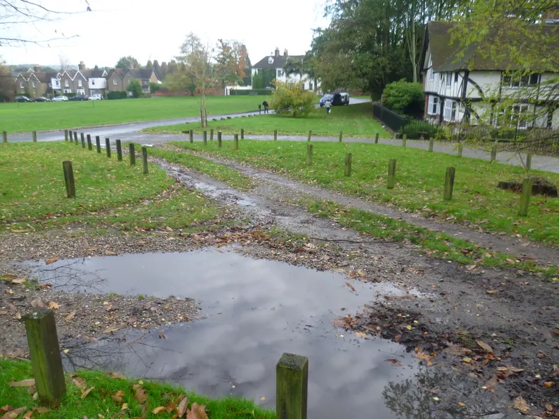
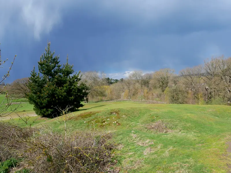
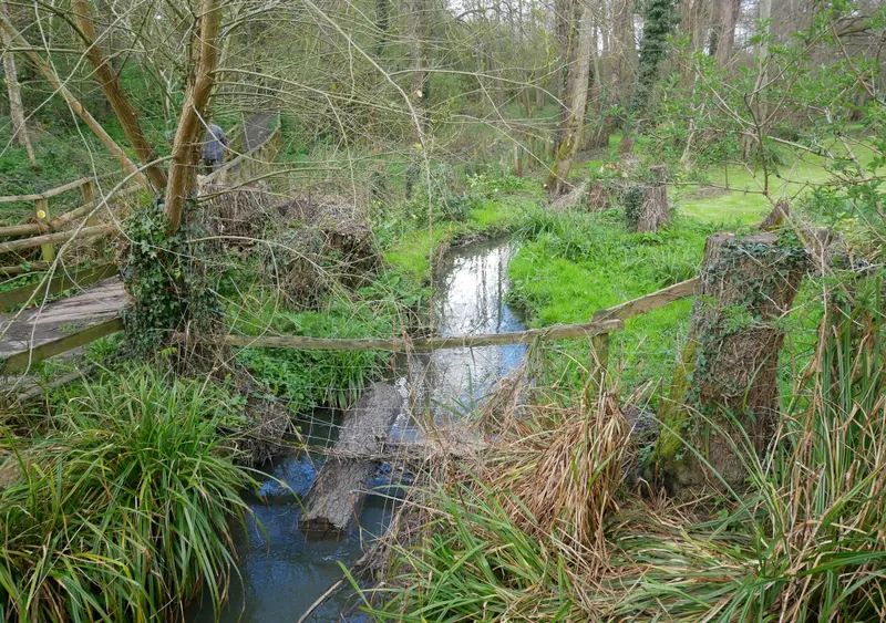
In Bearsted, you can apply that idea to a village tree, a woodland scene or a small detail visible from a path. This is a practical photography exercise, not a report of current leaf colour or a promise of peak conditions on a particular date. The reference photographs on this page show local settings, not a verified autumn sequence.
Choose a colour relationship rather than every colour
Begin with two or three colours that work together. A warm leaf against a darker green background may be clearer than a whole canopy containing many different shades. A pale trunk beside a patch of brown foliage may offer a quieter picture than the most colourful tree in view.
Move your attention between subject and background before taking the photograph. If the background contains a bright gap, it may dominate even when the main subject is colourful. A modest shift along the path can change which shapes sit behind a leaf or branch without requiring you to enter vegetation.
Try making one photograph with a strong colour contrast and another with closely related tones. Compare how each feels. The contrast version may be immediate and lively, while the more restrained version may reward longer looking. Neither needs additional saturation to justify being an autumn picture.
Use overcast light for layered woodland
Soft light can make a complicated woodland scene easier to read because the difference between the brightest and darkest areas may be less severe. This is useful when you want to show subtle colour rather than a dramatic shaft of sunlight. A grey sky does not automatically mean an unpromising day for photography.
Keep a large blank sky out of the composition if it adds little. Look for overlapping trunks, a path or a group of leaves that gives the eye a route through the frame. A smaller area of landscape may tell the seasonal story more clearly than a wide photograph trying to include everything.
Check sharpness before moving on, especially in dimmer conditions. A phone may use a slower exposure than you expect, and leaves can move even when the scene looks still. Brace yourself comfortably, hold the device steadily and take another version if the important detail is blurred.
Let fallen leaves create structure
A scatter of leaves can become a pattern, but a pattern needs a boundary. Look for a clear shape within the larger area: a curve, an edge or a transition between textures. Avoid treating every fallen leaf as an equally important subject. Choose the relationship that makes the arrangement worth looking at.
Work with what is already there. Moving leaves into an attractive arrangement changes the kind of photograph you are making and can disturb the setting. For this exercise, keep the landscape unarranged and solve the composition through framing. If a detail does not work, there will be another.
Consider a tighter, almost abstract photograph as a companion to a wider view. The two pictures can support each other: the broad scene establishes place and the small pattern communicates season. A set does not need every image to contain both pieces of information.
Keep a recognisable Bearsted context
If the place matters to you, make at least one image with enough context to explain where you were. A leaf alone could have been photographed almost anywhere. A familiar village arrangement, path or landscape relationship can connect the seasonal detail with the area without forcing a landmark into every frame.
Our Bearsted Green essay considers what makes a familiar view recognisable, while woodland and water looks at smaller scenes. Use those as different approaches rather than a list of exact camera positions to reproduce.
When captioning the photographs, record the actual location and date if known. Do not label a picture as a particular seasonal moment simply because its edited colours look autumnal. A useful record keeps observation, capture information and interpretation separate.
Edit for separation, not intensity
Start by checking exposure and white balance before increasing colour. If everything has an orange cast, the apparent warmth may be coming from an overall colour shift rather than the scene itself. Compare the edit with the original and ask whether the colours remain distinct from one another.
Use contrast carefully. Too much can make dark branches merge into a solid mass or turn bright leaves into harsh patches. Too little can flatten the relationship that made the photograph interesting. Make a small adjustment, look away briefly and return to the whole picture before changing more.
Keep an untouched original file. A version that works well on a small bright screen may look excessive when printed or viewed larger. Having the original available makes it easier to create a quieter print version later without trying to reverse a chain of heavy edits.
Make a repeat-visit notebook
Instead of trying to predict a perfect autumn date, record what you see on each visit. Note the general weather, the subjects that worked and the public positions from which you photographed them. A short notebook can reveal which kinds of scene interest you as the season changes.
Do not assume that the same location will produce identical colour each year. Treat return visits as opportunities to observe differences rather than confirm a timetable. This makes the project more interesting and avoids disappointment when the landscape does not match a photograph found online.
If you are visiting Bearsted Woodland Trust, consult its current information before travelling; our visit guide links to the organisation. Keep to suitable routes and respond to conditions on the day. A photography project should fit the place, not require the place to fit the project.
Choose three photographs that do different jobs
At home, select a place-setting image, a colour relationship and a detail. Lay them out together and remove any picture that merely repeats another. A small coherent set is easier to enjoy than a large collection in which every frame competes to be the most colourful.
For a framed print, test the crop and viewing distance. Fine leaf detail may suit a position where you can stand nearby, while a stronger arrangement of trees may read better across a room. Our print-size guide explains how image and outer frame dimensions affect that choice.
Browse the woodland collection for examples of local scenes with different scales of attention. The current reference photographs are credited on the image credits page. They are a starting point for thinking about composition, while your own autumn observations provide the seasonal evidence and personal meaning.
A place for your wall.
Explore the collection, then choose a size and finish at your own pace.